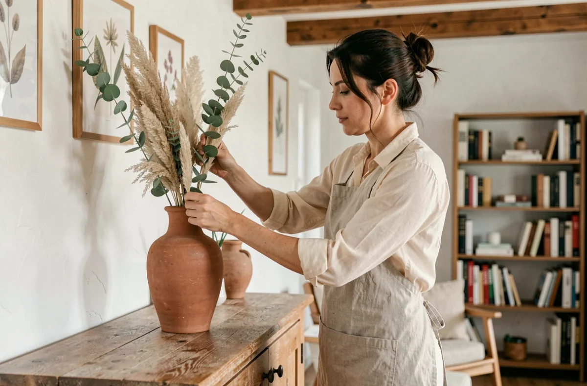
The layering of materials and reuse are no longer marginal stances. They now structure interior decoration choices from the design phase, well before selecting a color or a light fixture. We observe that the most successful projects start from a technical reading of the existing structure, not from a mood board.
Indoor air quality and choice of decorative coverings
A wall covering or laminate flooring directly alters the composition of the air you breathe. The emissions of volatile organic compounds vary significantly from one material to another, and ventilation alone does not compensate for a poor finish choice.
We recommend systematically checking the emission labeling before any purchase of paint, varnish, or soft covering. Environmentally friendly materials are not limited to “bio” ranges: some classic mineral coatings (lime, clay) show superior performance compared to recent labeled products, provided compatibility with the existing substrate is checked.
This substrate/covering compatibility is a point that mainstream articles almost always overlook. Applying a lime coating on an unprepared plaster wall will cause peeling within a few months. Check the substrate’s absorption, its pH, and the possible presence of previous water-repellent treatments.
Specialized resources in interior decoration on Habitat Guides allow for a deeper understanding of these technical criteria before embarking on a decorative renovation project.
Reuse of materials in interior decoration: method, not DIY
The 3daysofdesign 2026 report positions reuse not as an economic compromise, but as a desirable approach in its own right. The nuance matters: reusing a recovered material requires a prior assessment of its structural condition and compatibility with the intended use.
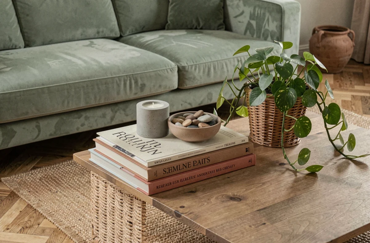
A reclaimed old floorboard must be checked for residual thickness and moisture content before reinstallation. Wood that is too thin will not withstand additional sanding. Wood stored in a humid environment will warp after being installed in a heated room.
Here are the checks to carry out before integrating a reused material into a decorative project:
- Measure the remaining useful thickness (for wood, tiles, stones) and ensure it allows for implementation in accordance with best practices.
- Check for the absence of old toxic treatments, particularly lead paints on recovered woodwork and frames.
- Test dimensional compatibility with current supports: an old cement tile often has variations in thickness that require specific leveling.
- Allow for a loss margin greater than that of a new material, generally double.
This approach transforms reuse into a controlled aesthetic lever. Patina, irregularities, and signs of use become compositional elements, provided the implementation has been secured in advance.
Regulatory constraints that alter the decoration of rental housing
Since January 1, 2025, homes classified G in the energy performance diagnosis can no longer be offered to new tenants in mainland France. This prohibition redefines decorative priorities for landlords: insulating a wall from the inside reduces the living space and requires rethinking the furniture layout.
An insulating layer of a few centimeters on a load-bearing wall can render the intended space for a storage unit or sofa unusable. We find that rental decoration projects now incorporate this constraint from the planning stage, not after the insulation work.
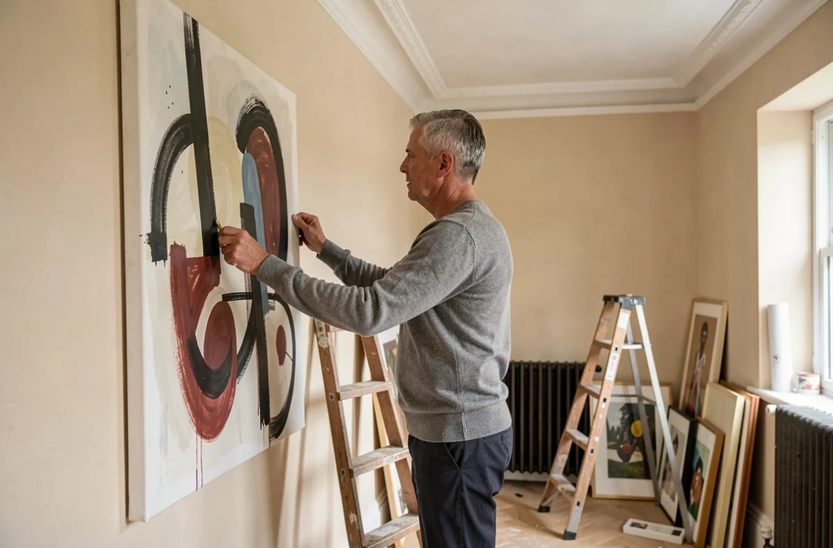
For owner-occupiers, the question arises differently but remains technical. Decorating a wall recently insulated from the inside requires waiting for the complete drying of the insulating complex before any application of decorative finish. An underestimated delay can cause blisters, mold under the paint, or peeling wallpaper.
Light and color: calibrate rather than decorate
The color temperature of lighting radically alters the perception of a wall color. A sage green chosen in-store under 4,000 K lighting will appear grayish under a home lamp at 2,700 K. We recommend systematically testing color samples on-site, under the actual lighting of the room, for several days.
The multiplication of light sources matters more than their individual power. Three low-intensity light points, positioned at different heights, create a richer ambiance than a single powerful ceiling light. This principle of light layering applies to all rooms, including often-neglected hallways and entries.
The choice of wall color should also take into account the orientation of the room. A north-facing facade receives cold and indirect light all year round: warm shades (terracotta, yellow ochre) correct this perceived coldness. Conversely, a south-facing room can accommodate cool or neutral colors without appearing austere.
- North orientation: favor saturated warm tones to compensate for the lack of direct light.
- South orientation: cool or desaturated shades remain readable and avoid an overloaded effect.
- Cross-ventilated rooms (double orientation): work by zones with different color intensities according to the dominant light source of each wall section.
The 3daysofdesign 2026 report confirms this trend towards layering and calibrating rather than uniform decoration. The value of use takes precedence over immediate visual effect. A well-calibrated interior in terms of light and materials ages better, requires less renewal, and offers measurable comfort on a daily basis.
The most sustainable decorative choices are based on a technical reading of the space before any aesthetic consideration. Support, ventilation, orientation, material thickness: these parameters determine the success of a project far more than the latest trendy palette.